Laughing Pundits

Propaganda & The Benign Elite of Rational Manipulators

Illustration, Opinion, Process

“The world informed by “public relations” will be but “a smoothly functioning society,” where all of us are guided imperceptibly throughout our lives by a benign elite of rational manipulators.” – Edward Bernays, Propaganda 1928

I NEVER WANT TO BE LEFT IN A ROOM WITH A MONKEY

The following project is a continuation of Once the Buddha Was A Monkey. It explores the horror of the ape within, personified in the political caricatures fronting the media. The series was completed the same year as the White House Correspondence Dinner in which Obama infamously made a laughing stock of Trump, putting a flame to the elephant’s tail that ran and dominated the 2016 election circus.

In light of current events, I have chosen to discuss the themes of the drawing via excerpts from Propaganda, an evangelical book for marketers, written by the father of Public Relations, Edward Bernays.

Bernays began his career with the Committee on Public Information promoting American war efforts during World War I. It was here that he learned to fear the erratic nature of the masses, and the potential use of persuasion as a means of control. He describes how in 1915, “governments first systematically deployed the entire range of modern media to rouse their populations to fanatical assent. Here was an extraordinary state accomplishment: mass enthusiasm at the prospect of a global brawl that otherwise would mystify those very masses, and that shattered most of those who actually took part in it. The Anglo-American drive to demonize “the Hun,” and to cast the war as a transcendent clash between Atlantic “civilization” and Prussian “barbarism,” made so powerful an impression on so many that the worlds of government and business were forever changed.”

To this day, you see the same spurious and emotionally divisive advertising unleashed on screen, fought on such news sites as Fox and CNN as observed this election cycle.

Although Propaganda is nearing a century old, the tactics explored have ominous relevance today. Bernays paints a pictures of a commercial complex closely tied to politics. He explains how mega corporations gained their power and influence, how lobbyists earned their seat at the table, and the means in which a powerful few have garnered authority, captured the attention, and manipulated the masses.

THE BENIGN ELITE OF RATIONAL MANIPULATORS

“Of “the sheep now wretchedly straying” the world over, “Especially it is to be desired that, inspired by divine grace, they should cease to wander amidst heresies through the unhappy pastures of infidelity, drinking deadly and poisonous water, but be placed in the pasture of the true faith, that they may be gathered together in saving doctrine, and be led to the springs of the waters of life.”

Scan

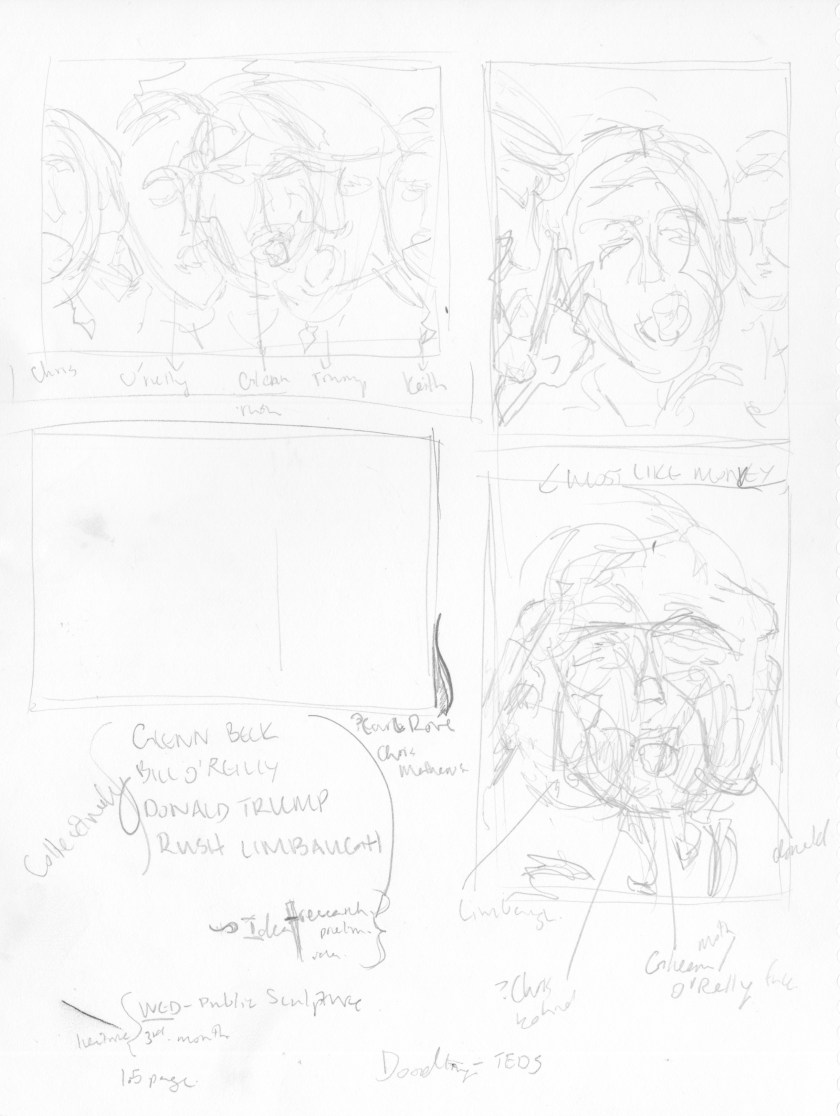
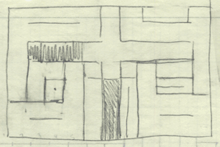
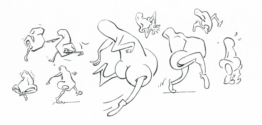
Initial sketches. Experimenting with layout.

“He grasps the picture which fits in so neatly with his prejudices, and makes it his own. He buys the sheet and pillowcase costume, and bands with his fellows by the thousand into a huge group powerful enough to swing state elections and to throw a ponderous monkey wrench into a national convention.”

pundits

Popular right wing pundits and political voices in 2011: Donald Trump, Glen Beck, Bill O’Reilly, Rush Limbaugh

“Manipulation of news, the inflation of personality, and the general ballyhoo by which politicians and commercial products and social ideas are brought to the consciousness of the masses. The instruments by which public opinion is organized and focused may be misused. But such organization and focusing are necessary to orderly life.”

Scan 12

Composition outline

“Bernays arrived at the bleak view that “the democratic El Dorado” is impossible in modern mass society, whose members—by and large incapable of lucid thought or clear perception, driven by herd instincts and mere prejudice, and frequently disoriented by external stimuli—were not equipped to make decisions or engage in rational discourse.”

pundits_laugh_1900

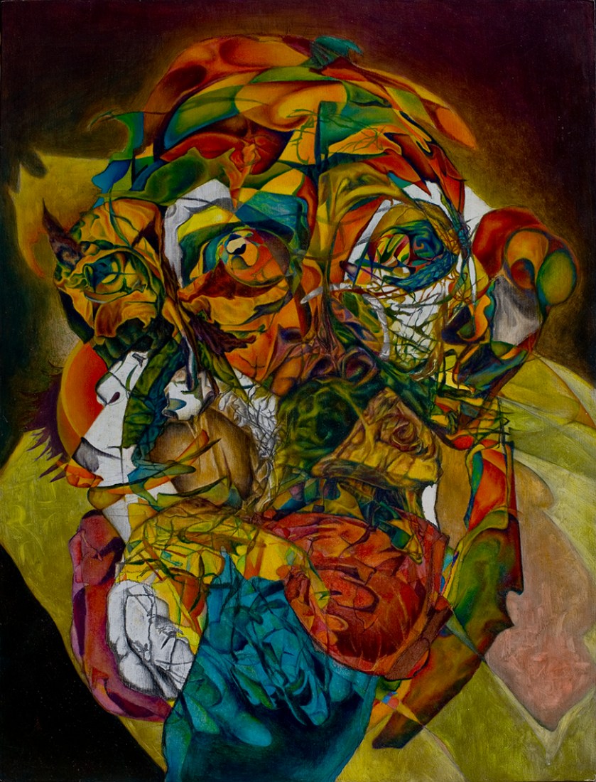
The Laughing Pundits & The Benign Elite of Rational Manipulators

Democracy” therefore requires a supra-governmental body of detached professionals to sift the data, think things through, and keep the national enterprise from blowing up or crashing to a halt. Although mankind surely can be taught to think, that educative process will be long and slow. In the meantime, the major issues must be framed, the crucial choices made, by “the responsible administrator.” “It is on the men inside, working under conditions that are sound, that the daily administration of society must rest.”

THE MONKEY WRENCH

“There is a vast and continuous effort to capture the public minds in the interest of gaining acceptance for some policy or commodity or idea.”

pundits

monkeycomp3

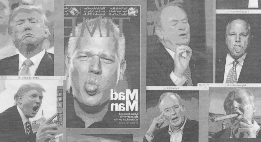
Reference Images: Pundit Caricatures & The Flippant Apes

“The individual is appealed to by means of every approach—visual, graphic, and auditory.” The Propagandist “takes account not merely the individual, nor even the mass mind alone, but also and especially the anatomy of society, with its interlocking group formations and loyalties. It sees the individual not only as a cell in the social organism but as a cell organized into the social unit. Touch a nerve at a sensitive spot and you get an automatic response from certain specific members of the organism.” In order to do this, one must “secure the cooperation of the key men in every group—persons whose mere word carry authority to hundreds or thousands or hundreds of thousands of followers.”

Scan 11

Composition outline

“This invisible, intertwining structure of groupings and associations is the mechanism by which democracy has organized its group mind and simplified its mass thinking.”

pundits_reversed

The Monkey Wrench

We are governed, our minds are molded, our tastes formed, our ideas suggested, largely by men we have never heard of.” These “invisible governors” are a heroic elite, who coolly keep it all together, thereby “organizing chaos,” as God did in the Beginning. “It is they who pull the wires which control the public mind, who harness old social forces and contrive new ways to bind and guide the world.”

THE DEMOCRATIC DOCTRINE & THE RUBBER STAMP

“So ran the democratic doctrine. But instead of a mind, universal literacy has given him rubber stamps, rubber stamps inked with advertising slogans, with editorials, with published scientific data, with the trivialities of the tabloids and the platitudes of history, but quite innocent of original thought. Each man’s rubber stamps are the duplicates of millions of others, so that when those millions are exposed to the same stimuli, all received identical imprints.”

_dsc4578ed5white4

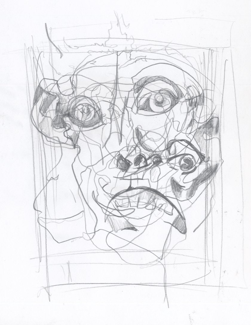
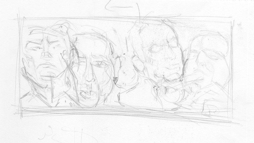
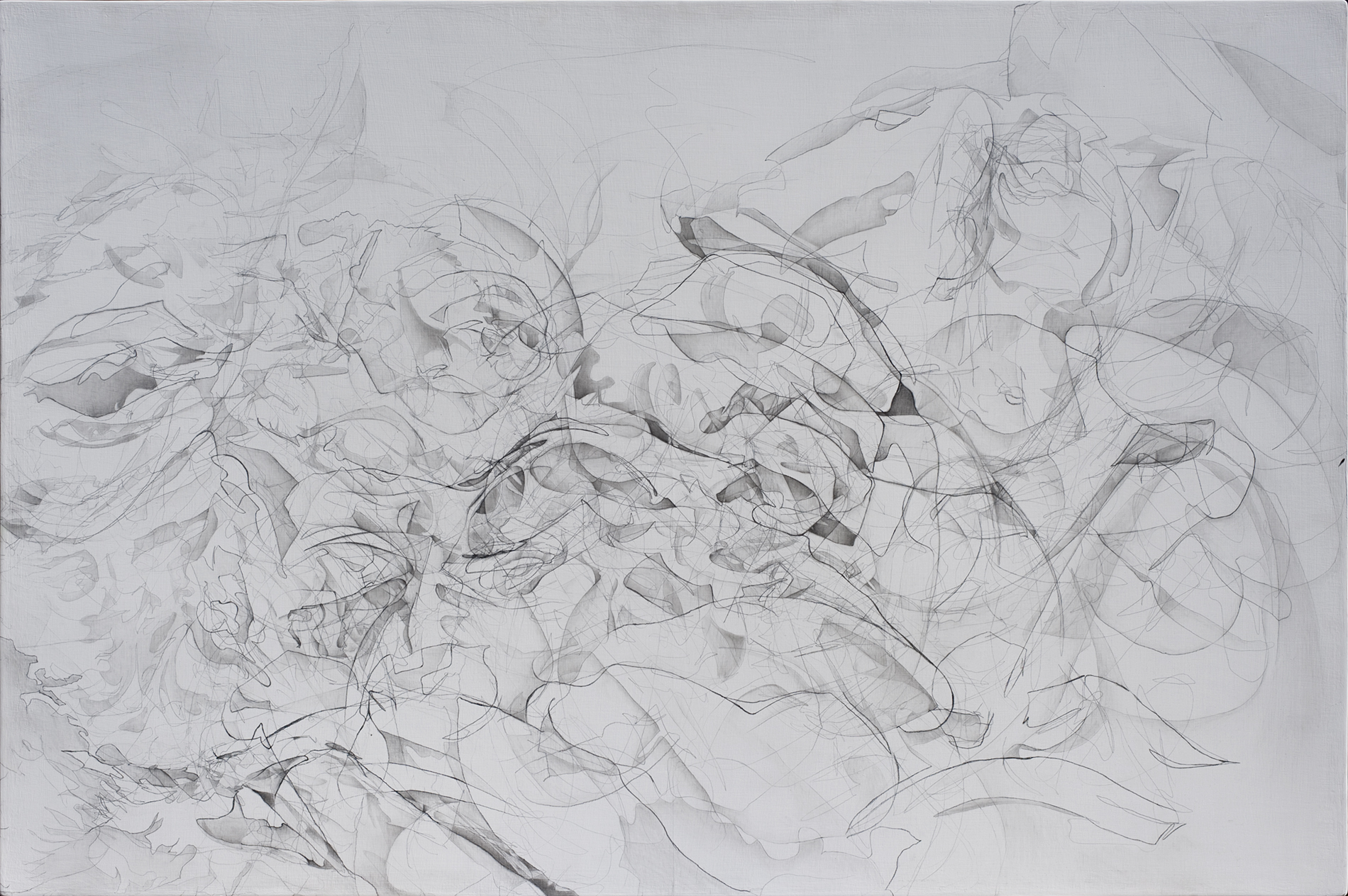
Unfinished piece. Example of the drawing process: Four faces drawn in blind contour.  Outlines of each seen in blue, pink, orange, and grey pencil. The lines are overlaid, enhanced, and shaded with charcoal, creating a composite face.

A LITTLE ABOUT MY PROCESS

The drawings were rendered in blind contour (drawn without looking at the paper), my hand drew as my eyes focused on the contours of the reference image. This technique places all attention on the object of desire, the outcome on paper is less important. The result is a entangled mask of wiry lines that echo the original image. I approach these lines like a road map that contains unexpected crossing-paths to explore later. After drawing each face in this manner, I went back in and developed shapes, establishing illusionistic value to forms I wished to bring out. The layered image combine into abstract, rhythmic landscapes. Although there is no clear focus, hints of the original faces are visible. Floating details entertain and gently draw the viewer in for exploration. The images are rendered with graphite pencil on gessoed birch frames. Graphite is the most ‘democratic’ medium. Its black, metallic shine defuses the image across the pristine, white slate – a reference to print media and the news. 

BEAT AT ITS OWN GAME

On November 8, 2016, the propagandist’s machine was beat at its own game. Who would have thought a reality star and internet troll would be our next president. The nation was in shock. Did our own hedonism get the best of us? It was as if we were indulging in a train-wreck reality show, pointing fingers and laughing hysterically at the silly characters on screen, when the monstrous head turned and engulfed us. Now we have to figure out how to survive in this alternate reality.

A con stole the game away from the establishment, but in so doing, exposed its cards and tricks. He woke up the nation and provided people a chance to take back their power. He has shown us we are just as integral to the propaganda machine as the puppeteers. As Bernay’s points out, “we have voluntarily agreed to let an invisible government sift the data and high-spot the outstanding issue so that our field of choice shall be narrowed to practical proportions.” I ask that you look at the media and learn to maneuver it. Pay attention to what messages you give consent, how you cooperate and surrender to the image crafted for you. Don’t get played by the monkey and don’t be the monkey. With that knowledge, I hope this divided nation will begin a conversation that works on bridging the gaps between us to form a more perfect union. 

LAUGHING PUNDITS HAS BEEN FEATURED IN:

MSU Exponent, Featured Student Artist. April 4, 2013

Vox Populi 2012 (M.S.U. annual juried exhibition) 

These Machines Kill FascistsBring Your Own Art Show, The Cottonwood Club. January 10, 2015


Advertisement

MOSIC: A DREAM APP

Experimental, Future, Illustration, Process

mosicman_sq_1900.png

THE FUTURE IS APPS

MY DREAM APP 

This assignment was an exercise of imagination and explores the potential use and intelligence of our hand held devices. I was asked to create a mobile app without limiting myself to current mechanical standards. I used this as an opportunity to explore my passion in music, user experience, and entertainment design. 

PROBLEM & OPPORTUNITY

THE ELECTRONIC GAP

Electronic music has seen a growth in popularity in the last 30 years, but unfortunately it still has some hurdles to overcome to gain broader acceptance in live performance. Artists such as Amon Tobin have found impressive ways to create eye catching shows using projection mapping that compliment and enhance the music. These displays, however, are not cheap. Far too often shows feels confined and robotic, as a DJ stands behind a laptop, twisting nobs and punching buttons on a table. Beyond visual entertainment, there is often a lack understanding and appreciation surrounding the skills required for such music production, because the auditory techniques and creative process are not transparent. 

This app merges electronic music and the human body, creating a physical performance that is more relatable and is a fun way to experience, make, and share music with friends.

INITIAL STUDIES

This slideshow requires JavaScript.

SOLUTION

TRANSFORM YOUR BODY INTO A MUSICAL INSTRUMENT

MOSIC is a MIDI controller, freed from the confines of a tablet, and expressed through the human body. Slide your phone in your pocket and start dancing! MOSIC uses your phone’s motion-sensors and radar (a future effect on your phone) to precisely record and sync your movements to prerecorded sound. Partner your movement with MOSIC’s mixing bed of digital, sampled, and analog sound.

HOW IT WORKS: Imagine your body is surrounded by a sphere of particles. Each particle is charged with a programmed sound. When a particle becomes excited or touched, it emits a sound. Your phone’s ‘radar’ is the particle sphere. MOSIC allows you to program sounds in the sphere and emits them according to your body’s proximity within the sphere. 

A VISUAL SIMULATION

(The performer here is using light reflecting technology but the concept is similar)

THE PARTS

  • HOME SCREENmosiclayoutslidepage1.jpg
  • MY PROFILE: Create a visual diagram to build your drum set by measuring the distance between your phone and key body joints. mosiclayoutslidepage2.jpg 
  • DRUM SETS: Partner your movement with a mixing bed of digital, sampled, and analog sound. Drag sounds to desired area in spheremosiclayoutslidepage3.jpg
  • EFFECTS: Allow you greater control over your performance. Change the pitch or change the loop length of a sound. Volume and pitch can be set at relative or static according to proximity to a sound.mosiclayoutslidepage4.jpg
  • PLAY: Press the green button, slide phone in your pocket and start dancing!mosiclayoutslidepage5.jpg

MARKET

Kids and young Adults

Smartphone APP Competitors:

  • Portable/Hand Held Music Devices
  • GyroSynth-hand held gesture driven music synthesizer
  • SoundPrism-Intuitive sound creation tool
  • Figure-sound production through reason
  • I Am Sampler-simple musical sampler

APPEARANCE

The illustration of this app is inspired by early pixilated video games from the 80s and 90s. I used a bright color palate, gleaned from games of that period. The graphics are boxy and intentionally a bit crude. 

REFLECTION

Although this was intended as a theoretical exercise, I have spoken to a few programmers to see if it could become reality. Similar devices exist, including: the theremin, an electronic music device, invented in the 1920s, that requires no physical contact and is played by the relative positioning of the performers hands to two metal antennas; 3D light sensors that sync body movement with computer actions (currently being used in the gaming industry and in expressive dance); and computerized gesture-control gloves

The relative positioning technology for mobile use currently doesn’t exist, however it is on its way to being developed. Radar chips (micro radar technology) and advancements in Virtual Reality are making the app appear more tangible. The possible uses for such technology would be immense and could have a range of uses beyond music, including sign language.

I’m excited too see where technology leads us in coming years. It is truly an exciting time to be in the field design. 


Library of Babel

Illustration, Process

A RECONSTRUCTED UNIVERSE

I created an pop-up representation of Jorge Luis Borges’ The Library of Babel (1941).

BREIF SUMMARY OF THE THE LIBRARY OF BABEL

The Library of Babel is a fictional universe conceived as a vast library of interwoven hexagonal rooms. Each room contains the bare necessities for sustaining life and four walls of bookshelves. The contents of these books are believed to contain every permutation of 23 characters. Most of the books are gibberish, but occasionally a word, sentence, or even page of coherent text can be found. In this all too precarious existence, the inhabitants of the universe assign meaning to the chaotic order that surrounds them. Some are driven mad, believing that one book exists that provides the master key to the entire library, a voice of god. The story is testament to the dubious human experience and efforts to find our purpose.

HOLES IN THE PERMUTATIONS

The first page and cover illustration plays with finding meaning within a coded universe. The letters are indecipherable until the viewer pulls the tab right, revealing the hidden title and question “You who read me. Are you sure of understanding my language?”

library_1440h.gif

By this art you may contemplate the variations of the 23 letters…

“In truth, the Library includes all verbal structures, all variations permitted by the twenty-five orthographical symbols, but not a single example of absolute nonsense. ….These phrases, at first glance incoherent, can no doubt be justified in a cryptographical or allegorical manner….No one can articulate a syllable which is not filled with tenderness and fear, which is not, in one of these languages, the powerful name of a god. (An n number of possible languages use the same vocabulary; in some of them, the symbol library allows the correct definition a ubiquitous and lasting system of hexagonal galleries, but library is bread or pyramid or anything else, and these seven words which define it have another value. You who read me, are You sure of understanding my language?)”

THE INFINITE BEEHIVE

The centerfold opens and expands to a hexagonal lattice, recreating the fabric of the universe.

library_popupopen_white_1900.gif

 The Library is a sphere whose exact center is any one of its hexagons and whose circumference is inaccessible.

Illustrated Text:

“The Universe (which others call the Library) is composed of an indefinite and perhaps infinite number of hexagonal galleries, with vast air shafts between, surrounded by very low railings. From any of the hexagons one can see, interminably, the upper and lower floors. The distribution of the galleries is invariable. Twenty shelves, five long shelves per side, cover all the sides except two; their height, which is the distance from floor to ceiling, scarcely exceeds that of a normal bookcase. One of the free sides leads to a narrow hallway which opens onto another gallery, identical to the first and to all the rest. To the left and right of the hallway there are two very small closets. In the first, one may sleep standing up; in the other, satisfy one’s fecal necessities. Also through here passes a spiral stairway, which sinks abysmally and soars upwards to remote distances. In the hallway there is a mirror which faithfully duplicates all appearances. Men usually infer from this mirror that the Library is not infinite (if it were, why this illusory duplication?); I prefer to dream that its polished surfaces represent and promise the infinite … Light is provided by some spherical fruit which bear the name of lamps. There are two, transversally placed, in each hexagon. The light they emit is insufficient, incessant.

Like all men of the Library, I have traveled in my youth; I have wandered in search of a book, perhaps the catalogue of catalogues; now that my eyes can hardly decipher what I write, I am preparing to die just a few leagues from the hexagon in which I was born. Once I am dead, there will be no lack of pious hands to throw me over the railing; my grave will be the fathomless air; my body will sink endlessly and decay and dissolve in the wind generated by the fall, which is infinite. I say that the Library is unending. The idealists argue that the hexagonal rooms are a necessary from of absolute space or, at least, of our intuition of space. They reason that a triangular or pentagonal room is inconceivable. (The mystics claim that their ecstasy reveals to them a circular chamber containing a great circular book, whose spine is continuous and which follows the complete circle of the walls; but their testimony is suspect; their words, obscure. This cyclical book is God.) Let it suffice now for me to repeat the classic dictum: The Library is a sphere whose exact center is any one of its hexagons and whose circumference is inaccessible”

THE VIRTUAL EXPERIENCE

I found a site that takes to heart Borges’ imaginary universe and strives to re-create the VIRTUAL LIBRARY online. I recommend excavating the library after reading the short story.

Jorge Luis Borges is one of my favorite authors, for his blend of philosophy, science and imagination. If you would like to check out more of his writing, I highly recommend Collected Fictions by Jorge Luis Borges

Kisman’s Self

Illustration, Process

It’s there when we wake up and slips away when we fall asleep, maybe to reappear in our dreams. It’s that feeling we have of being anchored in a body we own and control and perceive the world from within. It’s the feeling of personal identity that stretches across time, from our first memories, via the here and now, to some imagined future. It’s all of these tied into a coherent whole. It’s our sense of self.” (Am I The Same Person I Was Yesterday? New Scientist, 2011, pp 41-42).

THE NEW SELF

Am I The Same Person I Was Yesterday?” asks the NewScientist in a thought provoking article in the Existential Issue discussing identity.  It is difficult to prove what the self is, where it is, and whether it is valid entity or a mere mirage. The self is described like a ghostly ameba that is everywhere (activating all spots of the brain) but cannot be found or corned in a room. It operates like a magician, “pulling the wool over our eyes,” by giving us the appearance of consistency but in truth, is always changing with our body and mind.

newscientist_white.jpg

The New Scientist is an international magazine focused on the philosophical and technical implications of science and technology. ‘Am I the Same Person I was Yesterday‘ in the Existential Issue, explores the theme of self and its construction.

Although difficult to pin down, the self can be described as an entity constructed by the brain and processed in three interlocking parts:

  1. The Physical Self: The sense of being located in a distinct body, in a distinct place.
  2. The Psychological Self: The ability to differentiate between self and others, arising from personal experience and the autobiographical perspective formed in memory.
  3. The Agent:  The feeling of being in charge and initiating actions. The liaison between the physical self and the psychological self.

The project that follows, tackles the conundrum of the self, the beheld trinity, and calls into question its solidarity in changing times. 

drawingprocess

Notes from the article and early illustrations exploring the concept of self

DESIGN INFLUENCE

Designers research and imitate notable specialists in their field to expand their creative knowledge. This project was intended to develop my skills using a notable specialist as inspiration for my own work. I was asked to create an illustration that speaks in the language of a designer, but ultimately uses my voice.

THE COMPLEXITY OF SIMPLICITY

My design influence for this project was Max Kisman, a notable graphic innovator celebrated for his early computer generated typefaces and illustrations. I thought he would be fond of this article and it would be an interesting subject to try to tackle in his terms.

Max believes that design speaks clearest when simplified. He uses graphic symbolism and iconography to narrate complex issues in the world of politics and technology. Limiting himself to only a few colors and working within a two dimensional box, forces his work to be intentional and integrated. These tight compositions are offset by an iconic, crude style, featuring figures reduced to blocky forms cut out like paper dolls. His illustrations are simple yet dense, playful and poetic, and carefully intertwined compositions balancing opposites with concise precision.

ILLUSTRATION PROCESS

This was an interesting venture for me as Kisman and I have different artistic leanings. Kisman is more direct, limited, and his figures are cruder then mine. My work is more subtle, organic, and my images more visually dense. However, we both enjoy the process of weaving forms, playing with positive and negative space, and view image making like a puzzle, searching for the optimal, most connected composition.

kisman_process_earlystep.gif

Initial Studies of Kisman. Observing his style. Looking at how to combine and overlap images, exploring the theme of self in the New Scientist article.

REDUCE, REVIEW, REPEAT

Reducing forms to express complex ideas is more difficult than is appears. You can create complex images by manipulating and artfully overlapping visuals, creating a generalized form that describes more than one object visually. However, as forms are reduced, they become less definable and more open to interpretation. It can be difficult to control how an abstract form is seen.

When I showed my initial studies to peers, I discovered that my abstracted forms were often misinterpreted, confused or masked by unintended figures. In the beginning I was told my illustration looked like a hedgehog, later, I was told it looked like a fish with side burns. It was not until I showed my illustration to others that I became aware of some of these secondary distractions.

I found I regularly needed to ask others what they saw to objectively ‘see’ my illustration. In the beginning, I attempted to describe too much in a given image, resulting in at least one subject not being seen and others being compromised. About halfway through my development, I attempted to represent a clock and three heads in one circle, but was unable to find a suitable balance. The clock was never decipherable. I instead decided to depict a pendulum with the figures hands for the concept of time.

It was a struggle deciding which information was most important, what elements needed to be reduced or removed so the entire illustration could read better, while maintaining integrity with my conceptual goals and designer’s aesthetic.

kisman_process_illustrate.gif

Illustration Process. 1. Outlining Kisman’s images and playing around with form. Limited to three colors, exploring positive and negative space, weaving and reducing the image.


kismanselfw_72pp2560pxpxw

Final Illustration

THE THREE STRANDED SELF

Using the voice of notable graphic innovator, Max Kisman, the self formulates as a carefully intertwined balance of opposites. The red presents the calculated, agent mind. The white symbolizes the esoteric. The two come together to form a third body, facing forward. Its face confronts the viewer and challenges the concept of its own reality with one eye open and one eye shut. Its head hovers over the body as the container and categorizer of memories. Below, a pendulum swinging from white hands, questioning the consistency, time, and solidarity of its being. The eye of the self searches without rest, as it occupies everywhere and nowhere in lack of true definition within the form.

Kisman_article_1900.jpg

Illustration placed in article


REACTION

My illustration transformed quite a bit during this process. I feel my ultimate illustration did justice to the article, to Max Kisman’s style, and to my own artistic goals. Although the forms are more rounded than my influencer’s and include a frontal face (which he rarely depicts), my illustration could easily be mistaken as my influencer’s work. The result is thought provoking, playful and inviting. It was a fun exercise to get me out of my box and gave me an opportunity to look at my own self.  


A CLOSER LOOK

Illustration, Process

THE ART OF TYPE

Typography, the style, appearance, and arrangement of printed matter, can be likened to body language for the written word. In regards to communication, it is reported that only 7% of the message comes from the literal word. About 38% comes from tone and 55% from body language. How does this translate to the visual representation of words? Typography not only establishes the figure of the word, but helps create the mood, as well as cadence of conversation. This project tests the limits of typography by rendering the message via form alone.

CHALLENGE

Express the definition of the word using only typography.

DEFINITION 

pro-pin-qui-ty // n. 1. Proximity; nearness. 2. Kinship. 3. Similarity in nature.

PROPINQUITY is the state of being close to someone or something. It can mean physical proximity, the psychological kinship between people, or a similarity in nature between things. In social psychology, the propinquity effect is a leading factor in interpersonal attraction, describing the tendency for people to form bonds with those whom they encounter often, as well as share and reflect characteristics (as in like-attract-like).

PROCESS

1. I researched existing fonts on the web that articulated the definition of closeness and could be used for inspiration.

propinquityfont

2. I manipulated these fonts by stretching, playing with kerning, baseline, and form to make them my own.

propinquity_fontplay_process_animation

(These early experiments I felt didn’t quite get to the essence of the definition and were limiting in form and layout).

3. I went back to the drawing board. With pencil and paper I was more effective at altering and playing with layout options.

propinquity_gravityed_bw

I began by dissecting each letters into its component, geometric forms (circle, lines, U’s, diagonals, etc.), observing the rhythm of the word. I played with the concept ‘like-attract-like’, and connected letters with similar features such as those with tails (p-p-q-y) and those with bowls (p, o, p, q). With each iteration I looked for ways to condense the word. I began wrapping the word around itself, as if each letter was a magnet pulling on its neighbor.

propinquity_process_animation

Using a rectangle base, I squeezed the letters inside, using the same visual language of straight lines to create each form. After flipping a couple of letters (‘p’ and ‘q’), joining the tilde on the ‘i’s, and defining the ‘y’ with the tail of the ‘t’, I was able to create a word that almost perfectly mirrored itself across the vertical axes. I then outlined the letters, defining the letters in the negative and bonding each letter to its adjacent. In the final product, each letter touches and defines its neighbor, creating a perfectly bonded word with not a breath of space, perfectly expressing propinquity.

propinquity_1440adjust

A SURPRISING TWIST

As first glance, the word appears as an indecipherable maze, with no goal or coherent path. With determination, the viewer adjusts his perspective. A letter peaks at him, defined within the outline. Slowly the word emerges from the negative, the viewer forms a kinship with the shape, unable to separate from this newly defined image. 

AWARDS & RECOGNITION 

Propinquity was selected by international jury as one of the top 25 graphic design pieces of 2013. It was featured in  Creative Quarterly Issue 29, and Creative Quarterly 100 Best Annual 2013 (featuring the top 100 artists, designers and photographers of 2013).

ONCE THE BUDDHA WAS A MONKEY

Illustration, Process

“I NEVER WANT TO BE LEFT IN A ROOM WITH A MONKEY”

In case you were wondering, the project that was chosen over Sensitive Sniffles was a portrait of an ape-like monster. In the same nonsensical evening Sami found her nose watering, she admitted to me a fear, that she never wanted to be left in a room with a monkey. And like before I was on the floor laughing. (That said, monkeys are strong, erratic animals, so the fear was valid however amusing.) The absurdity and realism of the experience produced the creature that followed.

MONKEY PLAYS JOKER

Monkeys, although adorable, are a crude version of ourselves. Smart and powerful, they pose a threat to our own security both physically and symbolically. They are caricatures of men, representing our most despised traits. They are the jokers and the politicians. They have demeaned an entire race. Yet, they still have a foot in  idealized nature, in a purity we often feel detached from. This concept of the monkey as a phantom of ourselves, the animal inside we can’t escape is where I found twisted humor in Sami’s comment.

RENDERING

monkeydrawing1

Preliminary studies of horrified apes

monkeyscancr.png

Creating the face: A composite of layered blind contour images

monkey_72pp

Charcoal drawing and oil paint on gessoed masonite, 18″ x  24″. 2011

THE MONSTER

The drawing is designed to be disorienting, in your face, comical but frightening. The colors are bombastic, clown-like, broken and compartmentalized. The piece is tight and feels a bit claustrophobic. There is an underlying tension created in balanced opposites. The face is both abstract and illusionistic, shallow and deep, geometric and organic. Within the chaos a fractured image of a phantom emerges.

ONCE THE BUDDHA WAS A MONKEY HAS BEEN FEATURED IN:

Creative Quarterly 100 Best Annual 2013

Selected by international jury as one of the top 25 Fine Art  pieces of the year, featured in Creative Quarterly’s 100 Best Annual, honoring the top 100 artists, designers and photographers of 2013.

1503361_10203359980182834_1420040005325506719_n.jpg

Creative Quarterly Issue 29

CQIssue29_Monkey.png

MSU Exponent, Featured Student Artist. April 4, 2013

MSUexponent.png

Vox Populi 2012 (M.S.U. annual juried exhibition) *Received an Honorable Mention

img_3613img_3620


AHH CHU!!! Watery Nose On The Loose

Illustration, Process

I’m in the process of scanning in old projects, process journals and sketches. It’s neat to go back and revisit the journey that brought me to where I am today. One of my favorite parts about going through old drawings is stumbling upon those concepts that didn’t quite make it, the fugitives that for whatever reason were discarded or deemed less worthy.

I’M SO EMOTIONAL THAT’S WHY MY NOSE KEEPS WATERING

One project I came across that never fully materialized, was this rather absurd series inspired by  fellow artist, Sami Hinckley. After a few cocktails and high on life, Sami turned to me frantically looking for a tissue and exclaimed, “I’m so emotional, that’s why my nose keeps watering!” I burst out laughing. First at the idea of her nose having autonomous, sensitive feelings. Second, imagining that nose supplying emoltionaly rich water to a growing seed. Third, wondering whether these sporadic waves of emotion would effect the seed’s growth and health. Lastly, that somehow her nose just can’t stop pouring water. Just how much water are we talking about, how deep in are we! Luckily thing settled down a bit, we did not drown in snot, and I found a tissue for her to wipe her ‘watery’ nose.

Although that project took  another turn, I thought the sketches for this concept were particularly endearing. I’m considering making an animation or gif for the emotional nose. Because hey,  who’s to say noses don’t have feelings. Sorry for turning my back on you young nose, maybe one day we will make something of you and your fountain of emotion.

nosebw.png

Coat of Arms

Illustration

Yesterday I worked on an illustration for my brother’s most recent song, Coat of Arms. The first time he played the song for me I pictured Simon and Garfunkel riding unicorns into space.  

In tune with the 70s/80s, I made a sparkle dreamscape in the shape of a coat of arms. Referencing the Neverending story, I have a noble sphinx guarding the shield to the left. In the center, a burning sun shield inspired by Shiva. On the right, a dancing unicorn as one of the mounted supporters. The three characters describe the armed women in the song.

Stylistically, the illustration is still a bit raw. I left it as a pencil drawing, as if a kid sketched it in hopes to escape to another world, or perhaps, it was a drawing he found in a book that would transport him to that magical place.

At some point I will go back in with pinks and purples to make it into the true 80s dreamscape it was meant to be, but for now, black and white looks just fine. 


coatofarms_edlevel2

Check out the song here!


Support Kyle on Patreon!
www.patreon.com/kylesorenson

Her coat of arms
Was red and yellow
And blazed bright as a fire

It scorched my hand
And left a brand
A burning coat of arms

Her coat of arms
Was pink and blue
And vibrant as the sun

So light and free
It stayed with me
A dancing coat of arms

Her coat of arms
Was black and purple
And nobly restrained

So bold and stark
It left a mark
A regal coat of arms