THE ART OF TYPE
Typography, the style, appearance, and arrangement of printed matter, can be likened to body language for the written word. In regards to communication, it is reported that only 7% of the message comes from the literal word. About 38% comes from tone and 55% from body language. How does this translate to the visual representation of words? Typography not only establishes the figure of the word, but helps create the mood, as well as cadence of conversation. This project tests the limits of typography by rendering the message via form alone.
CHALLENGE
Express the definition of the word using only typography.
DEFINITION
pro-pin-qui-ty // n. 1. Proximity; nearness. 2. Kinship. 3. Similarity in nature.
PROPINQUITY is the state of being close to someone or something. It can mean physical proximity, the psychological kinship between people, or a similarity in nature between things. In social psychology, the propinquity effect is a leading factor in interpersonal attraction, describing the tendency for people to form bonds with those whom they encounter often, as well as share and reflect characteristics (as in like-attract-like).
PROCESS
1. I researched existing fonts on the web that articulated the definition of closeness and could be used for inspiration.

2. I manipulated these fonts by stretching, playing with kerning, baseline, and form to make them my own.

(These early experiments I felt didn’t quite get to the essence of the definition and were limiting in form and layout).
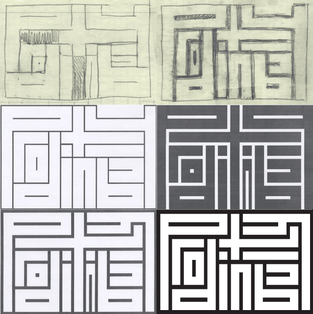
3. I went back to the drawing board. With pencil and paper I was more effective at altering and playing with layout options.

I began by dissecting each letters into its component, geometric forms (circle, lines, U’s, diagonals, etc.), observing the rhythm of the word. I played with the concept ‘like-attract-like’, and connected letters with similar features such as those with tails (p-p-q-y) and those with bowls (p, o, p, q). With each iteration I looked for ways to condense the word. I began wrapping the word around itself, as if each letter was a magnet pulling on its neighbor.

Using a rectangle base, I squeezed the letters inside, using the same visual language of straight lines to create each form. After flipping a couple of letters (‘p’ and ‘q’), joining the tilde on the ‘i’s, and defining the ‘y’ with the tail of the ‘t’, I was able to create a word that almost perfectly mirrored itself across the vertical axes. I then outlined the letters, defining the letters in the negative and bonding each letter to its adjacent. In the final product, each letter touches and defines its neighbor, creating a perfectly bonded word with not a breath of space, perfectly expressing propinquity.
A SURPRISING TWIST
As first glance, the word appears as an indecipherable maze, with no goal or coherent path. With determination, the viewer adjusts his perspective. A letter peaks at him, defined within the outline. Slowly the word emerges from the negative, the viewer forms a kinship with the shape, unable to separate from this newly defined image.
AWARDS & RECOGNITION
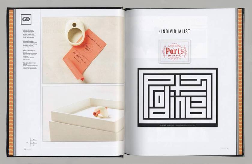
Propinquity was selected by international jury as one of the top 25 graphic design pieces of 2013. It was featured in Creative Quarterly Issue 29, and Creative Quarterly 100 Best Annual 2013 (featuring the top 100 artists, designers and photographers of 2013).


